From “R” to Rooster
Simply remarkable! Sometimes, cleverness lies in adding a tiny mark that completely transforms something. We tip our hats to whoever is responsible for creating this logo. By adding a small, seemingly insignificant mark just below the letter “r,” the designer has cleverly created the image of a rooster.
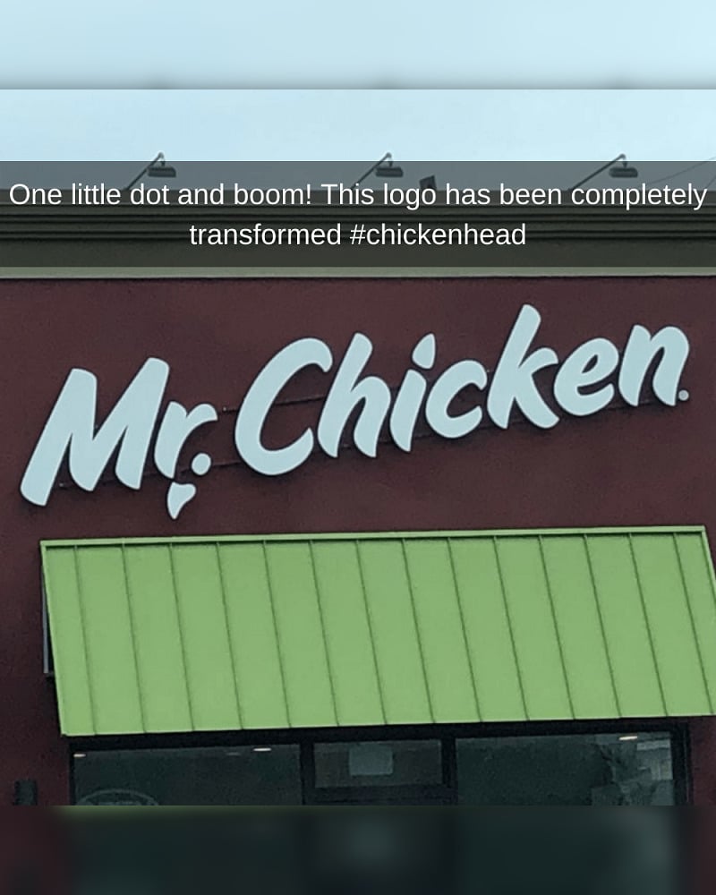
We’re left wondering what Mr. Chicken sells. Perhaps just chicken nuggets, or do they offer dishes as creative as their logo? Unfortunately, you might not find the menu by searching for “Mr. Chicken” on Google, as there are many different restaurants with the same name worldwide.
Pages: Page 1 Page 2 Page 3 Page 4 Page 5 Page 6 Page 7 Page 8 Page 9 Page 10 Page 11 Page 12 Page 13 Page 14 Page 15 Page 16 Page 17 Page 18 Page 19 Page 20 Page 21 Page 22 Page 23 Page 24 Page 25 Page 26 Page 27 Page 28 Page 29 Page 30 Page 31 Page 32 Page 33 Page 34 Page 35 Page 36 Page 37 Page 38 Page 39 Page 40 Page 41 Page 42 Page 43 Page 44 Page 45 Page 46 Page 47 Page 48 Page 49 Page 50 Page 51 Page 52 Page 53 Page 54 Page 55 Page 56 Page 57 Page 58 Page 59 Page 60 Page 61 Page 62 Page 63 Page 64